MARY POPPINS TYPEFACE PORTRAIT
This student project remains one of my favorite pieces despite the years that separate me from its creation. This piece lives in the space between design and art, and as such holds a special place in my heart.
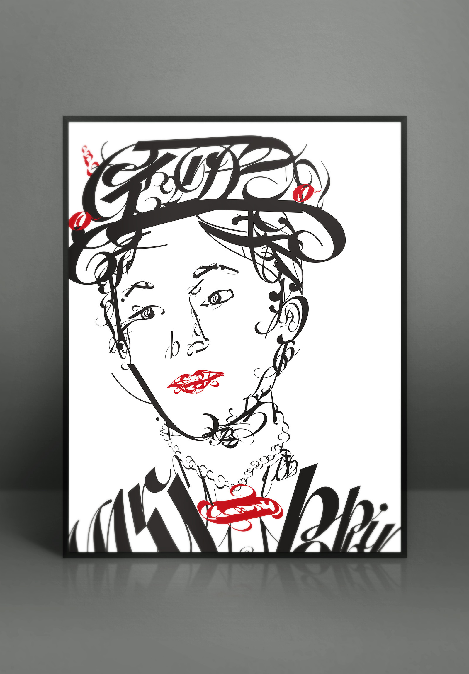
The brief for this piece was to select a single typeface and use only the letter from the name of the person you selected for the portrait. A fun challenge designed to make you think more about the forms of letters and how they can be used to convey meaning beyond the simple straightforward use of simply being blocks of text. I selected Mary Poppins for my portrait, and Snell Roundhand as the font. The flourishes of the script seemed appropriate for what is an overall whimsical but serious character like Mary Poppins.
The brief also included an additional challenge of keeping to only one spot color. For me the choice was clear, Mary Poppins has one color that she is strongly associated with visual outside of her normal black and white color palette: red.