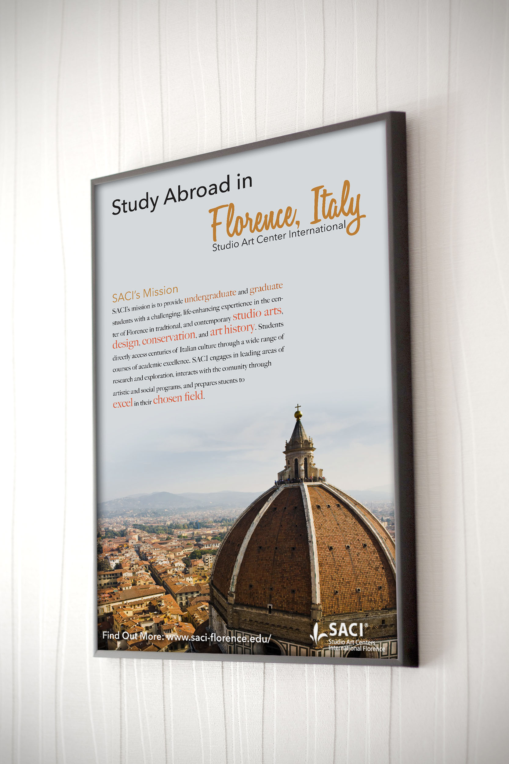
STUDY ABROAD, FLORENCE
This is one of the very first poster I designed as a student. Our brief was to use provided text and assets to create a poster for a study abroad program. I received Florence, and used the provided assets and text to create a minimalist poster with strong impact.
The strongest challenge of this poster was making the heavy text that had to be included easily digestible and eye catching all at once. To me the solution was simple to this end, highlight the keywords that would catch the attention of someone who was interested in what the program would have to offer. Enticing them to read and learn more. Choosing from the supplied assets the photo I believed had the strongest visual hook was a huge part in this design; a bird’s eye view of a historic and beautiful city from an iconic roof. Everything is meant to draw in the eye and encourage spending time with the overall piece.